qmethod
R package to analyse Q methodology data
Would you like to send the author an enquiry about Q methodology? Read this first.Plots
This is an example of what you can do with this package.
The plot below allows the viewer to quickly identify which are the most distinguishing statements (at the top, e.g. statements 16 and 33) and which are of consensus (at the bottom, e.g. statements 20 and 17).
It shows, all in one: the z-scores for each statement and factor, the statements of consensus (bottom), the statements over which factors disagree most (top), and the distinguishing statements for each factor (filled markers).
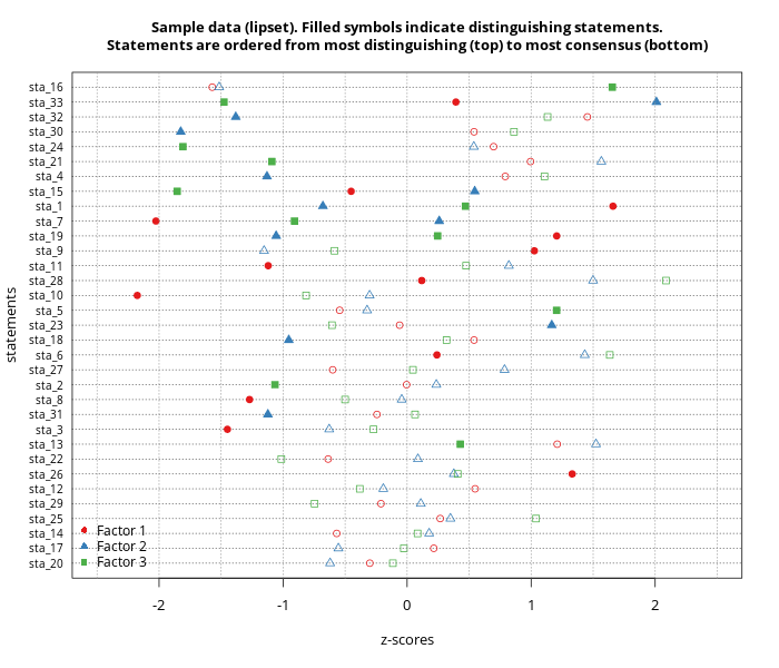
Distinguishing statements are those which z-score is significantly different across factors, in other words, those statements which markers in the plot are very separated.
A statement can distinguish all factors, where all markers are very separated (e.g. statement 33) or it can distinguish one factor from the rest (e.g. the marker for statement 16 in factor 3 is very separated from the markers of the other two factors, which cluster together on the left hand side).
Sample code for this image:
# Load data
data(lipset)
# Perform the Q analysis (extract with PCA,
# rotate three factors using varimax)
results <- qmethod(lipset[[1]], nfactors = 3,
                   rotation = "varimax")
plot(results)

# Create a title for the plot
title <- "Sample data (lipset). Filled symbols indicate distinguishing statements.
Statements are ordered from most distinguishing (top) to most consensus (bottom)"

# Plot into a PNG file
png("qplot.png", 700, 600, family="Open Sans")
plot(results, main = title,
     # Specify colours for markers
     colours = c("#e41a1c",  "#377eb8", "#4daf4a"),
     # Specify range of x axis
     xlim=c(-2.5, 2.5),
     # Fine tune the font size
     cex=1.1, cex.axis=0.8, cex.main=1,
     # Print the legend at the bottom left
     leg.pos="bottomleft")
dev.off()